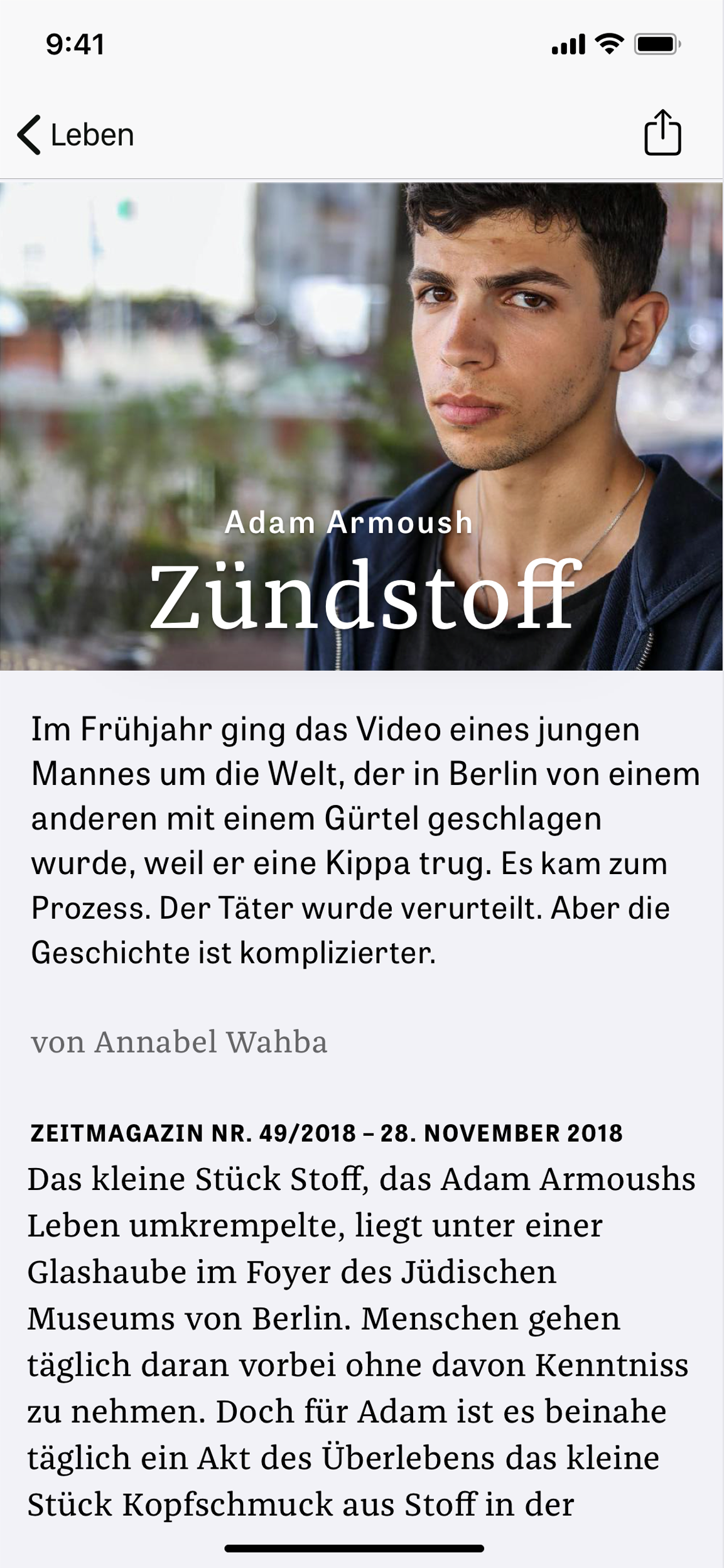
Screendesign
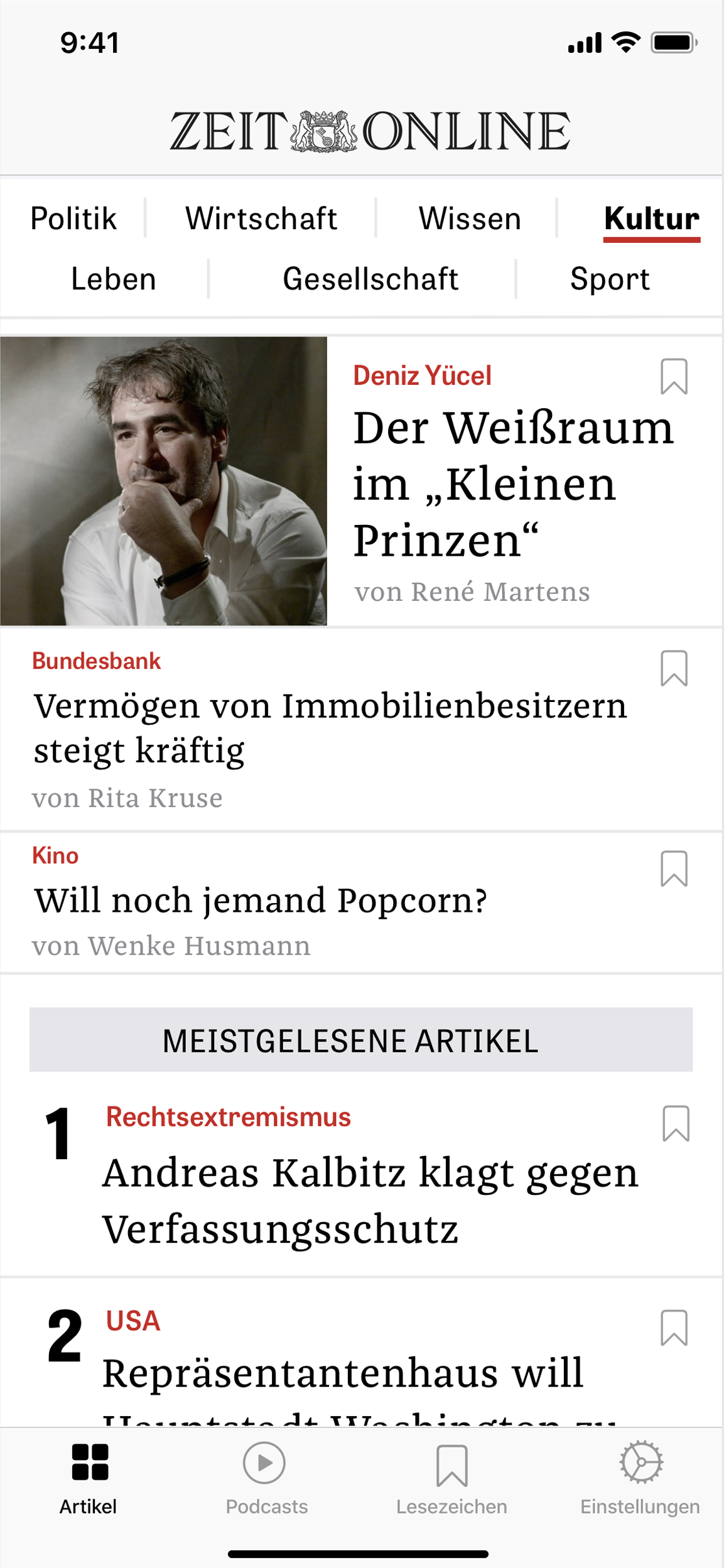
A navigation bar displaying all section titles gives users direct access to the topics they are looking for. In the original version, these were hidden behind a "hamburger" menu—an element removed during the redesign. This eliminates the need to navigate through the menu, thereby improving usability. The introduction of a tab bar further enhances ease of use, providing access to articles, podcasts, saved bookmarks, and settings.
Home Screen
The overview of individual articles has been reduced to their headlines; the lead article also includes a preview image. This creates a hierarchical structure that makes the articles' priorities and lengths visible. To better convey the app's newspaper-like reading experience, the headline font was changed to *Die Zeit*'s signature serif typeface.
Article Screen
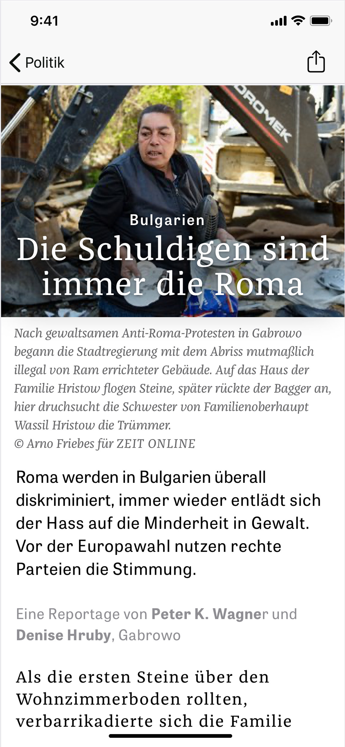
On the article pages, the focus is on the text and its readability. Consequently, the navigation bar and tab bar are hidden to maximize the space available for the article text. Placing the large-format article image alongside the headline at the top of the screen visually introduces the article and separates it from the body text, thereby ensuring an uninterrupted reading flow.
Z+ Article
In addition to the free articles in the Zeit Online app, paying subscribers have access to Zeit+ articles. While their basic structure mirrors that of standard articles, they are visually distinguished by a different background color.